Why accessibility in email isn’t optional anymore
Accessibility matters, not just because of legal requirements like the European Accessibility Act, or EAA, (don’t worry, we’ll explain), but because it’s the right thing to do. We’re recapping our latest episode of Emails Not Dead, the crew welcomes back Megan Boshuyzen, Senior Email Developer at Sinch Mailgun and Mailjet, for her third appearance.
Email accessibility isn’t about compliance, but communication
Accessibility in email isn’t a “nice-to-have.” It’s a foundational principle for reaching your full audience.
Accessible emails are legible, readable, actionable to as many people as possible, regardless of their ability.

From poor mobile reception to low vision to full blindness, the reality is clear: if you’re not designing with accessibility in mind, you’re excluding people. And those people are already part of your audience.
Globally, 1.3 billion people live with some form of disability, according to the World Health Organization. Of those, an estimated 736 million are email users. Screen reader users alone represent a potential $59 million in lost revenue if brands fail to support them with accessible design. That’s a huge opportunity missed.

The law is catching up: What the EAA means for B2C brands
The European Accessibility Act (EAA) went into effect in June 2025, setting a new bar for digital inclusion. While B2B businesses are currently exempt, any B2C brand selling directly to EU consumers must comply. That includes email.
So, what does that mean for senders?
If you’re using full-image emails, you need to rethink that strategy or add thoughtful, meaningful alt text. You should be following the Web Content Accessibility Guidelines (WCAG) as a baseline. And yes, even if your company is based outside the EU, these standards will apply to your emails if you’re reaching anyone inside it.
Accessible emails should meet the following minimum criteria:
- Readable typography: Body text at least 16px, with headings in the 18–20px range.
- Sufficient contrast: A minimum contrast ratio of 4.5:1 for body text and 3:1 for large text.
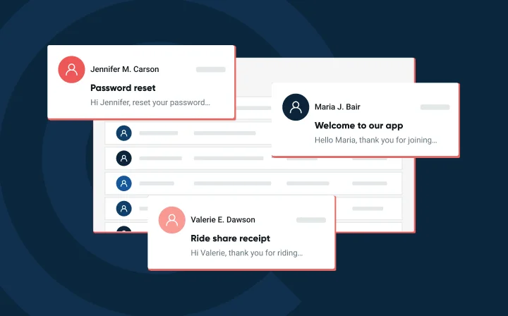
- Semantic structure: Use proper HTML structure (headings, lists, links) and include meaningful alt text for images.
- Keyboard accessibility: Emails should be navigable by keyboard, with visible focus indicators for links and interactive elements.
Accessibility isn’t just a compliance exercise – it directly impacts deliverability, engagement, and trust. And as regulations tighten, it’s quickly becoming a non-negotiable part of modern email strategy.
If you're already following best practices—like using live text, ensuring strong contrast, and designing with buttons—you’re probably already 80% of the way there.
Practical steps for better accessible emails
For marketers and email developers ready to step up, here’s how to start.
- Text alignment: Use left-aligned text for paragraphs longer than three to four lines to give readers a consistent anchor.
- Paragraph structure: Break large blocks into smaller, scannable chunks for better readability on all devices.
- Bold usage: Use bold sparingly to highlight key points without overwhelming the reader.
- Calls to action: Use buttons instead of plain text links for better visibility and easier interaction.
- Color contrast: Avoid hard-to-read combos like yellow on white or red on black unless it’s essential to your brand.
- Screen reader testing: Use tools like Email on Acid or Mailgun Inspect to make sure your emails are compatible.
Penalties for non-compliance: What happens if you don’t comply with the EAA
Legal penalties and fines
- The European Accessibility Act (EAA) requires member states to impose penalties that are “effective, proportionate, and dissuasive”.
- Typical administrative fines across EU countries start at about €5 000-€20 000 per violation.
- In many jurisdictions, unresolved issues can trigger daily fines (e.g., up to €1 000 per day) until remediation.
- In certain countries, more severe cases may lead to higher fines or other sanctions. In France, fines can reach up to €250 000 for public-facing platforms; in Germany, penalties under the national law can be up to €100 000 or more; and in Italy, non-compliance may result in fines up to 5% of annual turnover in serious cases.
Market & operational consequences
- Beyond fines: non-compliance can lead to removal or suspension of market access for non-compliant products/services.
- Businesses may be excluded from public procurement opportunities if accessibility obligations are not met.
- Brand and reputational damage: negative publicity, loss of customer trust, potential lawsuits from users or advocacy groups
Global context
Although the EAA is specific to the EU, many global jurisdictions are increasing enforcement of digital accessibility laws, meaning risk is not limited to Europe. (You may add a sentence about analogues like the US Americans with Disabilities Act or Australian legislation if you wish.)
For a company sending emails to or serving customers in the EU, compliance is not optional – even if the organization is based outside the EU.
Practical steps for improved email accessibility with fonts, colors, and more
For marketers and email developers ready to step up, use the checklist below as a practical baseline for building emails that align with EAA expectations and WCAG 2.1 AA guidance.
- Text alignment: Use left-aligned text for paragraphs longer than three to four lines to provide a consistent reading anchor. Avoid centered or justified body copy, which can disrupt reading flow for users with cognitive or visual impairments.
- Typography: Use widely supported, predictable fonts. Set body text at a minimum of 16 px, with headings typically in the 18–20 px range. Maintain adequate line height and spacing so text remains readable across screen sizes and email clients.
- Paragraph structure: Break long blocks of copy into smaller, scannable sections. Short paragraphs, clear spacing, and logical grouping improve readability for all users, including those using screen readers or magnification tools.
- Bold usage: Use bold sparingly and intentionally to highlight key points or section headers. Overuse can reduce scannability and interfere with assistive technologies that rely on consistent text structure.
- Color contrast: Ensure sufficient contrast between text and background colors, with a minimum ratio of 4.5:1 for standard text and 3:1 for large text. Avoid combinations like yellow on white or red on black, and do not rely on color alone to convey meaning.
- Structure and semantics: Use semantic HTML to establish a clear reading order, including proper heading hierarchy and list structures. Write descriptive link text that clearly explains the destination instead of generic phrases like “click here.” Provide meaningful alt text for images that communicate information or context.
- Calls to action: Use buttons instead of plain text links to improve visibility and usability. Buttons should be large enough to be easily activated, clearly labeled, and visually distinct from surrounding content.
- Interactivity and keyboard access: Ensure emails can be navigated using a keyboard alone, with logical tab order and visible focus indicators for links and interactive elements. Design clickable areas with a minimum target size of 44 × 44 pixels to support touch and motor accessibility.
- Testing and validation: Test emails with screen readers and keyboard-only navigation using tools like Email on Acid or Mailgun Inspect. Verify that content order, link labels, and interactive elements behave as expected, and keep basic audit records to demonstrate ongoing accessibility checks.
Email accessibility is bigger than code. It’s culture.
Creating accessible email isn’t a single task. Brands need to integrate accessibility into their entire email culture, from voice and tone to code and layout. When we serve the people who need the most help, that just helps everyone else.
That cultural shift also requires operational follow-through. Teams should be trained on accessibility fundamentals so designers, developers, and marketers share a common baseline. Accessibility checks should be embedded directly into email workflows—reviewing typography, contrast, structure, and interactivity before campaigns are approved or sent. And as regulations like the EAA take effect, maintaining a lightweight audit trail becomes essential. Documenting testing results, known exceptions, and remediation steps helps demonstrate good-faith compliance and creates accountability across teams.
Accessibility works best when it’s not treated as a one-off fix, but as a standard part of how email gets planned, built, reviewed, and sent.
Ready to improve your email accessibility?
Enhance the message. Don’t be the message.
Accessibility isn’t just a checkbox. It’s a standard for how we treat our subscribers and our digital community. It reflects respect. It builds trust. And it future proofs your brand against shifting expectations.
Watch the full podcast below.
FAQs
Yes. The European Accessibility Act applies to any business that offers digital services, including email communications, to recipients in the EU. If even part of your audience is located in the EU, your email templates, content, and code must meet accessibility standards.
The EAA follows accessibility principles similar to WCAG 2.1 AA and EN 301 549. For email, this includes:
- Using semantic HTML such as headings, paragraphs, and lists for structure and navigation
- Ensuring keyboard accessibility with logical tab order and visible focus indicators
- Maintaining sufficient color contrast and readable font sizes
- Adding alternative text for all meaningful images
- Creating responsive layouts that remain functional when zoomed or viewed on different devices
Not always. Even if a provider offers accessible templates, you must still confirm that:
- The template uses correct semantic structure and supports keyboard interaction
- All content such as text, images, and links meets accessibility requirements
- Different versions like mobile or dark mode are equally accessible
- You maintain records of testing and compliance reviews
Penalties vary by country but can include significant fines, suspension of non-compliant services, exclusion from public contracts, and reputational damage. Businesses that ignore accessibility requirements risk financial loss and reduced customer trust.