Email accessibility mistakes that annoy subscribers & how to fix them
Email accessibility is a pretty simple concept: Everyone who receives your email should be able to read it and engage with it. Everyone. Making this happen, however, is a bit more complicated, which is why so many companies struggle to get it right.
But they have to get it right. Why? Over 12 million people in the US alone have some form of vision impairment, including color blindness. Hearing impairment is the third most reported chronic problem among the aged population, but 65% of people with hearing loss are younger than retirement age. And as much as 10% of the global population is dyslexic.
With millions of people encountering less-than-stellar email experiences, companies and developers who lead through accessibility will thrive over the coming years. It takes some extra effort, but it will pay off.
Here are some ways your emails might be inaccessible to certain subscribers. Most of them have to do with vision impairments, one of the most common accessibility needs.
Unreadable color contrast
WCAG standards recommend a minimum 4.5:1 contrast ratio for digital text. If your background is anything other than white, you have to be very selective in which colors you choose for text, buttons, and other elements. It’s very hard to distinguish between the foreground and background when they’re similar shades, so you should pair color with other cues like icons or text.
Even if you’re using a white background, you can still gum up the readability. Using yellow and pure green for text will irritate everyone, even subscribers with full vision. That’s because they have very low contrast ratios against white – less than 2:1. Black on white has the highest contrast, at 21:1. It may be “boring”, but it’s the easiest to read, by far. Ultimately, what matters more than that?
But, if you feel the need to use colored text, or if you have text or buttons that change colors when you hover over them, choose wisely. Use an accessibility testing tool like Email on Acid’s Campaign Precheck. Color contrast is one aspect of email accessibility that is tested by Campaign Precheck, so you’ll know if you’re ever sending out an email with text that is hard to read.
Microscopic or ‘creative’ fonts
You might be tempted to use goofy or wacky fonts if your brand guidelines allow it – Halloween themes are notorious for this. But it’s no fun if no one can read it, and reading crazy fonts is always harder on screens than on paper, especially on tiny screens.
Opt for simple and easily readable fonts rather than scripts or themed fonts (letters that look like dinosaurs or like they belong on a ransom note might not be the best choice). Sans-serif fonts like Arial or Helvetica are often preferred.

Also, use fonts that are larger than 14px in size. Again, it’s harder for everyone to read small fonts on screens. For anyone with even partial vision impairment, it becomes too much work, and they’ll abandon the effort.
Bunched up text
Insufficient line spacing (leading) and letter spacing (kerning), or large blocks of text without paragraphs or white space, make emails appear dense and difficult to scan and read.
Instead of large blocks, break text into smaller paragraphs and use semantic headers and bulleted lists; this structure not only enhances engagement but also enables screen readers to process and navigate the email content more efficiently.
Complex language
Employing overly complex sentences, jargon, or long, dense paragraphs makes the content harder to read and understand for everyone, particularly those with cognitive or neurological impairments.
An 8th-grade reading level is recommended for broad accessibility.
Not using semantic HTML
Screen readers are tools used to help people with vision impairments or other cognitive challenges read and engage with online content. They’re not just for blind people, but also for those with conditions like glaucoma and cataracts. But you must have accessible content in order for the screen reader to give a good experience to the subscriber, and semantic HTML is the key to doing this well.
Semantic HTML tells a screen reader how to interpret various elements such as headings, buttons, and paragraphs.
Using semantic tags such as <h1>, <p>, <button>, and <nav> enables the screen reader to tell the subscriber what those various elements are. It also allows for quicker scanning of the email. Otherwise, they have to wait for the reader to go through the entire email.
But with headings, they can skip faster to various sections. Other tags, such as <b> and <div>, are non-semantic HTML, and screen readers don’t respond to them. Here’s a list of more semantic and non-semantic HTML elements. Note that many email clients may not fully support ARIA roles, making this a complex area.
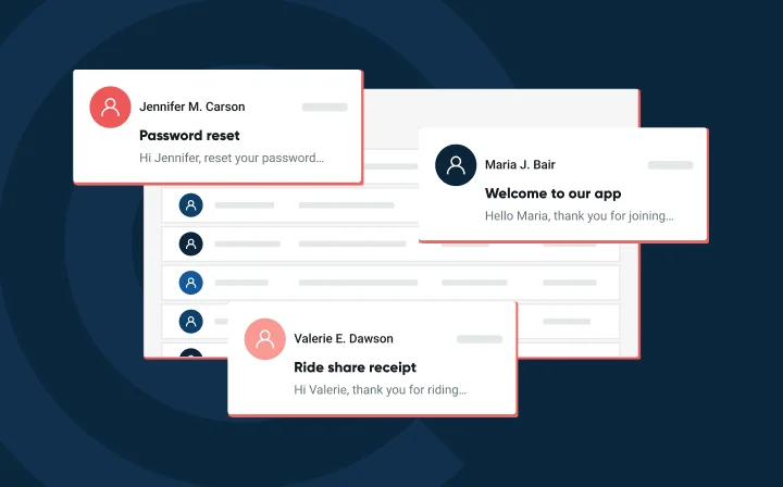
Sending image-only emails
This is one of the most annoying email experiences and one of the most unwise mistakes you can make. For one, many people with normal vision have their email client set to not render images. So if you send an email that’s just an image, they’ll see nothing when they open it up. That’s bad.
But beyond that, image-only emails are about the most inaccessible emails you could possibly send because screen readers can’t engage with any of the content within the image (unless you use alt text, which we’ll discuss in a bit). So if you create a big beautiful graphic, filled with text, images, and a CTA, anyone using a screen reader will miss your entire message.
Can’t do much worse than that when the goal is email marketing.
Instead, make sure your most important information is included as live text. Always use live text for important information and interactive elements. You can still include images to enhance key points or draw attention to specific things. You can even find ways to tastefully repeat your call to action in both live text and on images. But if you have to choose only one – live text is the way to go.
Ask yourself: “If none of these images load and I’m only left with text, will people still understand my message?”
An email accessibility check, like one from Email on Acid, can also help you spot gaps.
Burying key text on images
Image-only emails are one thing. But if you do send images as part of your email, you still need to make sure your key messages and CTAs appear in the text portion of the email too.
Why? Because if the CTA only shows up in the image, then anyone using a screen reader will not see it. If they don’t see it, they can’t click on it.
So, it’s okay if you want to put a CTA on the image to engage everyone else, but you should also put it elsewhere in the email where everyone will be sure to see it. And that goes for any other messaging or critical text elements that you want everyone to see.
And while we’re on the topic, even if you do incorporate messaging onto images, don’t forget about color contrast. In general, it’s risky to combine text with images, unless it’s done very delicately.
Like images, color contrast on buttons is a common cause of poor email accessibility. The color of the button, the color of the text on it, and the color of the background all work together to deliver either an easy reading experience or a frustrating one.
Buttons that lack sufficient color contrast, are too small, or don’t have clear semantic meaning (e.g., using `role=”button”` for screen readers) hinder interaction for users with motor impairments or those using screen readers.

Invisible links
It’s common to make links appear as different colors from the rest of the text. But for subscribers who have any form of color blindness, this increases the risk they’ll not see the link. Links that are not clearly distinguishable from surrounding text, either by color (without sufficient contrast) or underlining, can be missed by users. Red-green color blindness is the most common form, but there are others.
To avoid this, use other visual cues, such as underlining it, putting stars around it, or using arrows or other graphic elements to draw attention to it.
Non-descriptive link text
Using generic phrases like “Click here” or “Learn More” as hyperlink anchor text provides no context about the destination for screen reader users, who often navigate by a list of links.
Invisible images – no alt text
People relying on screen readers won’t be able to see your images. So, what can you do? The only way around this is to write alt text for every image. Without this, they might as well be invisible to a person with a vision impairment.
Alt text describes the image, but you must use enough detail so the subscriber has a clear understanding of what it’s showing, and if there’s any text on it, what it says.
Why doesn’t this solve the image-only email problem mentioned earlier? Because if the entire email is an image, then the alt text would basically have to express the entire message of the email, as contained in the image. If you’re going to do that, then why not just…write it in the email. Alt text isn’t the place for an entire email message.
Additionally, it’s not the place to be verbose, so you can avoid redundant phrases like “picture of” in alt text or body copy.
Videos without captions or transcripts
For emails containing video content, omitting captions or transcripts creates significant barriers for individuals who are deaf or hard of hearing.
Inaccessible attachments
Attaching documents that are not accessible (e.g., PDFs without proper tagging, alt text, or logical reading order) can prevent users of assistive technology from accessing important information.
Excessive or distracting animations
While engaging, too many animations can be distracting and disorienting, particularly for users with cognitive disabilities or sensitivities to motion.
Reading Spanish emails with an English accent
Email accessibility isn’t just about visual impairments. If you have email segments that include people who speak different languages, what will someone in that segment experience if they also rely on a screen reader?
You can tell a screen reader which language the email is written in, and this will affect how it communicates the email to the subscriber. It’s another detail that’s easy to overlook. It’s another thing that Email on Acid’s accessibility tool does automatically so you never have to worry about it.
Centering all your text
This generally looks terrible, so just don’t do it. It’s harder to read for everyone. But centered text, especially when we’re talking about entire paragraphs, is especially hard to read for people with dyslexia.
Left-aligned text is generally preferred because it creates a straight left edge where the first letters of each line align, making the email easier to read. This alignment helps subscribers quickly locate where each line begins, reducing effort for readers, including those with dyslexia or visual impairments.
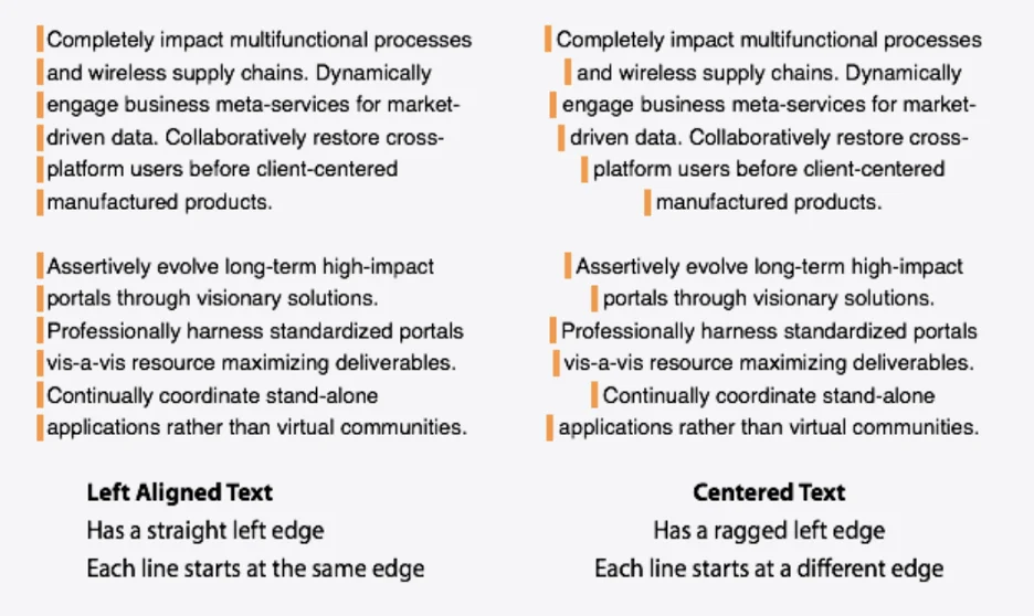
Still want to use centered text? Try to keep it just to headlines or short, standalone sentences.
Not coding tables correctly
If you use tables in emails for layout without adding the attribute role=”presentation,” screen readers can misinterpret them as data tables and vocalize all the HTML code aloud, which makes the experience confusing for subscribers relying on assistive technology. Adding role=”presentation” tells screen readers to treat the table purely as a visual layout element, improving accessibility significantly.
Missing or unclear subject lines and preheaders
This one again affects far more people than just those with vision impairments. Anyone relying on Siri or Alexa to read their emails to them will know if you make this mistake.
Screen readers and voice readers rely on clear subject lines and preheaders to convey what the email is about. Using vague or teasing subject lines like “It’s your lucky day…” or “Details inside!” can be confusing and frustrating – especially for people with cognitive impairments, memory loss, or dyslexia – as these phrases don’t provide meaningful context, making it harder for subscribers to decide whether to engage with the email.
First of all, never leave the subject line blank or let the pre-header text fill automatically. It won’t be inspiring to anyone reading or listening.
Instead, be intentional about what you write. Even if you don’t think what you’ve written is award-winning, studies show anywhere from a 3-8% increase in open rates when you include even any sort of intentional preheater text.
For subject lines, aim for something exciting and engaging, but don’t be dishonest or overly cheesy (unless that’s your brand, of course!). Subscribers have become wise to click-bait and sensational headlines. And if you promise something that the email doesn’t contain, your next email’s click-through rate is going to suffer… and so will your deliverability.
Don’t waste space with something like a repeat of the subject line. Instead, the preheader text should complement the subject. For example, if the subject line poses a question, the pre-header text could start to answer the question.
Need some inspiration: See five email preheader text ideas to get you started.
Not testing your emails for accessibility
Failing to test email campaigns with accessibility in mind, using tools or by simulating assistive technologies, means potential issues often go unnoticed before reaching subscribers. Nobody can become an accessibility expert overnight, but even fixing basic issues will push you ahead of many in the industry.
A good place to start is by understanding how easily your current emails can be consumed. This gives you a baseline to improve upon. But trying to figure things out yourself is not only more cumbersome, but it leaves a lot of room for error. Like anything with email efficiency. finding the right tools is key.
Email on Acid’s campaign precheck tool is designed to immediately identify potential issues and even offer instant solutions. And email accessibility is at the top of the list. Not only will it help you determine what needs more work, but it’ll also give you peace of mind that when you do finally hit send, everything is perfect. Learn more about the Email Accessibility Campaign Precheck tool and how it helps you send ADA-compliant emails.
Wrapping up
As you may have realized by now, there’s a lot more to creating fully accessible emails – for everyone – than simply using easy-to-read colors. The more elements you add to your emails, the more likely you might be creating an accessibility problem for some of your subscribers.
Want to learn more about email accessibility? Sign up for our newsletter to get the best tips and tricks in your inbox.