The basics of email dark mode
Find out what dark mode is all about, why users prefer it, and how it can help your deliverability.
We all know that light tends to win over dark. Just look at Star Wars or Lord of the Rings… or The Divine Comedy, for that matter. Pop culture – or just culture, really – has taught us that the dark side is not where you want to be. And for a long time, we believed it. But in recent years, the dark side of our apps has become the preferred choice for many users. It’s not just Discord or Twitter – dark mode is pretty much everywhere, email included.
We know. Email development is hard enough already. But this isn’t a trend you can run away from. So, buckle up and get ready to learn what makes dark mode in email so popular, how it can help your deliverability, and how to optimize your emails for dark mode.
There are no complicated definitions here – email dark mode is pretty much what it sounds like. Dark mode is a setting users can turn on so an app’s text displays on a black background instead of its regular light background. Not every website or app has a dark mode feature, but it’s common in text-heavy, white-background places like social media tools (Twitter, Instagram) and, of course, email clients.
The fanbase for dark mode is reason enough to motivate you to make sure your emails are optimized for this feature. Nearly 82% of users polled by Android Authority use the dark mode settings on the apps and smartphones alone. Traditionally, dark mode has been embraced and promoted by a more technical audience, but recent iPhone statistics show that users spend just over 50% less time operating their devices when dark mode is enabled. This is a representation of how dark mode makes the user experience more efficient. There are many claims as to why dark mode is superior (and we’ll get into them in more detail) but here are the top contenders:
Regardless of the reasons, the statistics show It’s clear that dark mode on devices is a must have option, but what does that look like for email specifically?
Dark mode turns background colors dark, and it also turns dark color text into light text so that words will actually show up against the new background. So, what does that look like in an inbox?
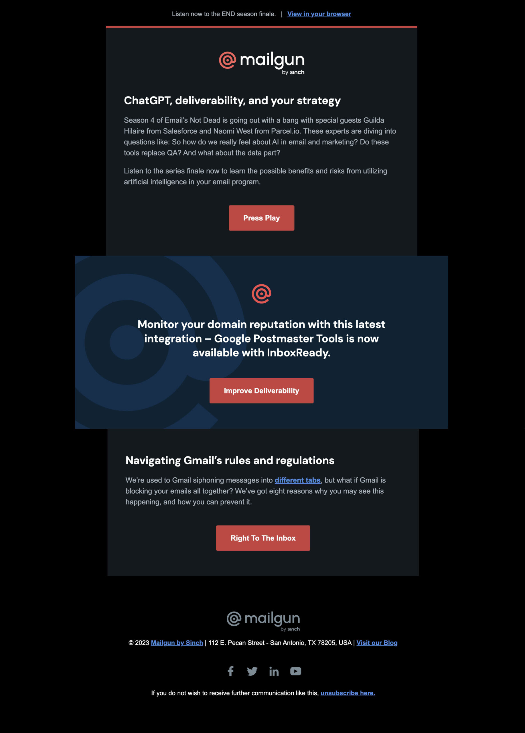
Let’s take our own Mailgun newsletter as an example. Not only are there changes to the background color and text body, but also changes to our logo and social icons.
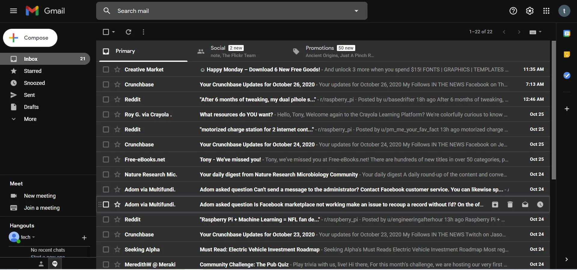
Another example is the Gmail inbox and the option to switch between dark mode and the classic “light” or “day” mode.
Source: Green Eye IT
Gmail’s “night” mode doesn’t change anything about Gmail’s tabs, its sidebar, or its general layout. The only changes are the background color and the font colors within the display.
Source: TechBlogBox
The switch to dark mode doesn’t change anything about Gmail’s tabs or its general layout and usability. The only changes are the background color and the font colors within the display.
The minor changes might feel anti-climatic – what is the point of dark mode, anyway?
There’s a couple of simple reasons for dark mode’s existence: many people find it, quite literally, easy on the eyes. While there’s conflicting research on whether dark mode really reduces eye strain and technological blue light exposure, some people prefer the darker background. Additionally, dark mode can extend the battery life of your phone or laptop by potentially using less energy.
The biggest true point in dark mode’s favor is probably its role in email accessibility. Dark mode’s high color contrasts and lowered brightness are generally considered to be more readable for people with visual impairments like light sensitivity.
While everyone has their preferred reason for using dark mode, its increased popularity over the past few years is hard to deny – so much so that most major email clients support dark mode settings for their users.
It might be easier for us to list which email clients don’t provide some sort of dark mode interface. But, for a quick reference, here’s are the major email clients that use dark mode email settings:
According to our 2021 Email Engagement report, it’s pretty much guaranteed that most of your contacts will use at least one of these providers. The challenge, though, is that all these clients render dark mode emails a little differently. Some will auto-invert colors, some won’t. Some will support @media (prefers-color-scheme), others (we’re looking at you, Gmail) won’t. Therefore, when sending emails, your best bet for maximum engagement is to make sure that they look great on both light and dark mode.You may be asking, how? And why? Well, let’s dive into how dark mode can affect your deliverability, and what you can do to make sure you stay on the good side of dark mode.
It’s important to remember that dark mode settings are primarily a user-controlled preference, and each email client, device, or service will have its own processes and design options for users wanting to implement this feature.
That being said, not all email clients are equal when it comes to dark mode optimization. The bulk of the heavy design work and optimization should be done on the email development side, and your emails should be tested and previewed to avoid deliverability issues.
There’s one big reason why dark mode can impact your deliverability, and that’s because email users are a fickle group. Many email clients don’t automatically optimize image email features (logos, pictures, etc.) for dark mode, and unoptimized content can make your emails look messy and hard to read.
Most dark-mode-using subscribers aren’t going to take time to try to figure out how to read your bad-looking emails. And why should they? Instead, they’ll ignore them, delete them, or mark them as spam – all of which have a negative impact on your deliverability.
On the other hand, if you take time to make sure your emails look their best even in the dark, they’re much more likely to be read and positively engaged with. And remember: good email practices and engagement metrics mean good deliverability.
So, what are some quick tweaks you can make to your email design to optimize your messages for dark mode?
You’ve got questions, and we’ve got answers. We’ve compiled some of the best and easiest ways to keep your emails looking good in dark mode.
Optimizing your emails and templates for dark mode doesn’t have to be hard at all. Below, we’ve collected some of our best design tips for making light emails dark.
Making your email images transparent is as simple as picking images without a colored or white background. Transparent images allow you to place logos, pictures, and more on any email background without having conflicting colors. Transparent background images that you find online will often have a white-and-grey checked background, like the example of our olden-days logo below.
Meanwhile, images with dark background colors will keep those backgrounds no matter how the email looks.

Make sure you choose images that will look the same on any background, and that you save them as transparent pngs. When your user opens your email in dark mode, your images will look seamless and clean, and your users will be able to view them without getting a messy or distracting layout. Remember to also test your logo contrast on a light and dark background – if your logo doesn’t stand out, your readers won’t know it’s you.
While you may want to avoid some image backgrounds so your graphics blend into dark mode, sometimes you may also want to draw attention to dark fonts and images to improve their visibility. You can very easily add a white outline to your images and text in image-editing tools like Photoshop.

This way, your images look exactly the same as they always do in light mode. However, they end up standing out and being readable to users in dark mode. Users will quickly dismiss your emails if they can’t read them, but outlines are a simple way to keep both readability and visual effect.
Plain-text emails are nothing to scoff at. They add authenticity and get rid of unnecessary, distracting bells and whistles – simpler designs are even a trend for this year. Maybe you don’t use many images or fancy logos in your email program, or you’d prefer not to deal with the hassle. The benefit of plain-text emails is they will always display in dark mode without a problem – a light background goes dark, black text becomes white text, and you’re good to go.
If you know your contact list likes straightforward emails without a lot of bells and whistles, plain-text emails may be right up your alley. They’ll look good, your users will get what they want, and your deliverability will be in great shape.
Email rendering is a developer’s nightmare. And, of course, dark mode wasn’t going to be any different. With each client rendering dark mode emails differently, it’s hard to build a message that will look the same across all providers.
Alongside these universal design recommendations, there are several coding fixes you can use to create a customized dark mode experience for your emails.
Use the in the tag to tell the email client that your email supports both light and dark mode.
If your user has this setting applied on their email app, these meta tags below will ensure dark mode is enabled:
u003cmeta name=u0022color-schemeu0022 content=u0022light darku0022u003ernrnu003cmeta name=u0022supported-color-schemesu0022 content=u0022light darku0022u003e
The :root selector will allow the email client to look for the color scheme style it needs without having to read through all the styles.
u003cstyle type=u0022text/cssu0022u003ern:root {rn color-scheme: light dark;rn supported-color-schemes: light dark;rn}rnu003c/styleu003e
You can create custom CSS styles to determine how different elements will look when using dark mode, like logos, font color, background, or link text.
Add this media query to your <style> block to personalize these elements with your brand’s preferred color values:
@media (prefers-color-scheme: dark ) {rn /* Shows dark mode logo */rn.dark-logo-wrapper,.dark-logo {rn display: block !important;rn}rn /* Hides light mode logo */rn .light-logo {rn display: none !important;rn}rnrn /* Creates a custom dark mode background color */rn .body {rn background-color: #282828 !important;rn color: #ffffff !important;rn}rnrn /* Sets the font color */rn h1, h2, h3, p, td {rn color: #ffffff !important;rn}rnrn/* Sets the text link color */ rn a { rncolor: #43D6B7 !important;rn}rnrn/* More styles here */ rn}
You can add this to your email’s <style></style> section to create custom dark mode styles for iOS, Apple Mail, and some versions of Outlook.
If you have light and dark versions of certain elements, like images, you’ll need to ensure the styles you’ve created for both dark and light mode show up when they are supposed to. This is especially important if you have a light and dark option for your logo and want to switch between them depending on whether the recipient uses dark mode or not.
An example of how this would look in your HTML is below:
u003c!u002du002d start HEADER_LOGO u002du002du003ernu003ca href=u0022https://mailgun.com/u0022 target=u0022_blanku0022u003ernrnu003cimg src=u0022https://www.yoursite.com/images/mailgun-light.pngu0022 class=u0022light-logou0022 /u003ernrnu003c!u002du002d Hide the dark logo in Outlook and Windows 10 Mail with conditional code but it will be revealed if dark mode is triggered u002du002du003ernu003cdiv class=u0022dark-logo-wrapperu0022 style=u0022mso-hide: all; display: none;u0022u003ern u003cimg src=u0022https://www.yoursite.com/images/mailgun-dark.pngu0022 class=u0022dark-logou0022 style=u0022display: none;u0022 /u003ernu003c/divu003e rnrnu003c/au003ernu003c!u002du002d end HEADER_LOGO u002du002du003ern
Not all these fixes will work across all clients and, no matter how much we try, our dark mode emails might end up looking slightly different across different apps and providers. If you want to be sure, test your email rendering before sending.
Email dark mode has become a popular feature since its creation. You should be ready to optimize your emails for your contact list if you want your emails to be engaged with and your deliverability to stay healthy.
Here are a few easy tips to remember for sending in dark mode:
Most importantly, you’ll want to test your emails before sending. The world of email is constantly changing and dark mode is too, so make sure you test your emails on the most popular email clients in your lists. You can do this manually, or using email testing tools like Litmus or Email on Acid.
Let’s face it. It might cause you a few headaches and it could get messy, but the dark side isn’t going anywhere. Email dark mode definitely has its advantages when it comes to deliverability and accessibility, so it’s time to just embrace it. Plus, you don’t really need Darth Vader, Sauron, or a visit to the ninth circle of hell to get it right.
Send me the Mailjet Newsletter. I expressly agree to receive the newsletter and know that I can easily unsubscribe at any time.