Dev Life
A deep dive into the Mailgun app: Part 2 – A most triumphant execution
When we started the Mailgun app rebuild journey three long years ago, we spent a good chunk of time on proof of concept, planning, and testing. Our ultimate goal? To create an app experience that showcases different products within our portfolio, allows easy navigation between them, and supports these products efficiently with a single infrastructure.
The scope of this project was so big, we needed more than one post to describe what drove the rebuild, how we did it, what we learned, and what implementing this new technology means for our future. In the first part of this epic journey, “Part 1: Excellent ideas”, we took you back in time to observe our process. We let you into our heads and shared our reasons for this undertaking, walked you through the challenges we knew we’d face.
Now, in ”Part 2: A most triumphant execution”, we’re taking you behind the scenes to show you how we implemented this project, how our teams collaborated, and the role design played in our thought process. It’s got drama, it’s got migrations…and probably a few too many sci-fi references. Join us for the ride.
A quick recap of how we got here
The drive to update the Mailgun app was inspired by the limitations of our legacy infrastructure, specifically with our polyrepo organization, where each frontend project had its own repository regardless of the fact that many projects repeated the same tasks. What did this mean for our teams? For starters, that locating specific code or finding bugs was about as easy as Deckard hunting down rogue replicants in a densely packed dystopian city.
Managing multiple repos with redundant features slows down response times and drains resources. Our solution? Reorganize into a modular monorepo structure. In Blade Runner terms, instead of hunting replicants across a sprawling city, we’d be navigating within a single megastructure where projects are organized into modules and replicants become searchable.
This plan of action would require implementing new tools into our stack, a new look and feel to our UI, and managing large amounts of legacy code. If you’ll allow us to paraphrase, “Man has made his match”…and now it’s engineering’s problem.
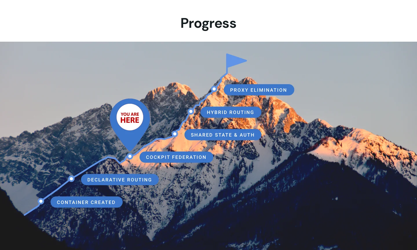
Module Federation
One of the earliest steps for setting up our new app was figuring out a way to reuse as much of our legacy system as possible so that we did not have rebuild it all. But we did not want to continue to support all our deprecated legacy dependencies. We needed a way to package our existing code in a way that wouldn’t be rejected by the new infrastructure.
Module Federation is a way of defining a chunk of code (our whole legacy app, in this case) as a singular, importable asset that can either be self-contained, or setup to share assets with the consumer. Module Federationprovided a solution, allowing us to repackage the existing code so that it could be consumed by the new platform without compromising all the new bells and whistles we planned for. Most of our devs could continue to make bug fixes and updates to our old code base, and the new app would get them for free!
In order to make this happen, we needed to create a declarative routing middleware that would allow us to direct traffic between the old and new apps. We will gradually port the legacy code into the new platform, but until then, this per-page routing solution would mean we would be able to launch new features without skipping a beat – and without the headache of rewriting everything at once. Because we already defined the rules, this would make it easier to change and maintain routing within our application.
In addition to the large-scale migration components, we also had to figure out the migration and adaptation of existing processes centered around features that would still need to function in a familiar way for the user in the new app.
Collaborating with design to build the signup process
So far, we’ve shined a light on some of the big-picture elements like storage and resource management. But this project was a rebuild of the full Mailgun app, which already contained functioning, customer-facing processes that we needed to either protect or improve.
The app signup process is a good example of how we had to evaluate current models, work across teams, and implement our new stack. When breaking down a project for action there are a few questions we always ask:
1. How do we currently source plan the data?
Strategy: Document the current signup and account creation logic for the existing Mailgun process. This would help us archive our past processes but also analyze exactly how we were going to alter the current system to lay the foundation for our update.
2. What are the steps from our current iteration to our desired state?
Strategy: Once we documented and planned our actions, we needed to improve our knowledge base. We focused on learning the conventions and capabilities for the React framework we would use to enable server-side rendering and additional features to support our efficiency.
3. What work is needed from other teams?
Strategy: Building out the UI. Because we were effectively merging two stand-alone products into a suite of products sharing an infrastructure, we needed to build out the UI at the same time we affected product changes. This would mean the majority of updates would also be redesigns.
Establishing the design scope
Our primary goal was to distinguish our products – Mailgun and Mailgun Optimize – without creating two separate infrastructures to support them. You could ask the question, why separate them at all? Why not just merge products, wouldn’t that be easier? Well, not really. Our products have very specific purposes, and buying into one of them doesn’t mean a user has to buy into all of them. Besides, the ultimate goal behind the rebuild was to develop an infrastructure that could support adding more products in the future without compromising backend functionality or creating a situation where products were hard to navigate from the user’s perspective.
The solution? Design. This meant setting new standards for our Mailgun and Mailgun Optimize apps in terms of illustrations, brand colors, and text formatting. It also meant aligning marketing to the way we talk about our products and how they work together.
Inside the mind of design
When we started building out the design process, we had to consider the shared areas of the app vs the app specific areas. Features like billing, and the signup process would be shared areas, vs. The independent areas of the UI that would serve our individual products.
We began back in 2021 by looking at the billing section and focusing on the logic of how we were going to handle users being able to have one billing account that supported the management and customization of multiple products. This set the tone for how we were going to move forward and analyze features like billing, or our sign-up process from the perspective of multiple products converging.
We captured all of the touchpoints that would be dependent on either a shared space, or a products specific space within the app. This included elements like a left nav that would be product specific and include settings that were also product specific but would also ensure shared spaces within the app were following the same patterns.
We did a lot of competitive research but also general design pattern trends to see how switching between products within a single app was being done today and what made sense with what was needed in the top nav.

Next, we looked at elements of the user journey so we could map out the design structure and color schemes that would help optimize the user experience. There were two questions we used to guide us:
- What flow would a user go into now that they’re moving around in a single app instead of two separate apps?
- How did we plan to handle and adjust the design flow around a particular feature within the new app?
We created designs that varied colors and placement to direct users to interactions within the app and then performed user testing to observe and validate user pathways. Where were the users navigating? What did their mouse movements tell us about any hesitation? What did they expect to see?
From this user testing research, we were able to fine-tune the design elements to optimize navigation in a way that was intuitive to our users. After this, a Beta experience was launched for select users that allowed us to collect information from real user sessions and instances to guide us on what worked, and what we still needed to tweak.
Replacing visual assets to align with branding
Changing the visual assets was one part navigation and one part unification. Styling the nav menus with our branded color suite may seem like a purely aesthetic need, but we knew we were creating the theme for how our products would be distinguished within a shared space for the future.
We created a structure for navigation that could be scalable across not only Mailgun and Mailgun Optimize, but also our other email products for the future.
Product icons would allow for independent brand awareness without creating the brand confusion of showing the full logos. This would also give us the opportunity to create a path for brand awareness for other products in our portfolio by linking to them from their icons. By adding an Explore area within the app where users switch between products, we would be able to help cross-sell to users and raise awareness about our full product suite.
And finally, as a team we thought it would be really cool to have a fresh, new look to go with the fresh, new technology to amplify the impact of all the new things we’d built.
As Portal evolves
Applications can’t stay stagnant, and Portal will evolve over time. That was the whole point of building something with logic and infrastructure that was made to scale. So, what are the things we expect to change first?
- Refining the deployment architecture: In “Part 1: Excellent ideas“, we talked about the volume of code we’ve written over the last decade – thousands of lines of it – and just like it will take time to gradually port over that code, it will take time to sunset our previous deployment processes. This meant that we had to build Portal to work with two deployment processes, our legacy processes and our new build using Cockpit – which was the easiest undertaking ever… This was a nightmare, two deployment processes! We’re nothing if not ambitious.
- Managing multiple code bases: As we work to gradually port over our code, we will continue to have to manage multiple code bases and port code over from different product sets before we can unify.
Feedback loop
Portal went through both user testing and Beta, so we were able to catch and fix all the bugs – said no engineer ever.
The app redesign was executed to serve both our users and make life easier for our internal teams managing the app. So, we implement feedback from both internal and external observations and comments. We set out with the intention that no process would be worse off, that the app update wouldn’t prioritize one process by sacrificing the quality of another. And we’re confident that everything is as good – or better – than it was in our legacy version.
Be excellent to each other and make cool things
How do you end a post when the project is ongoing? The Mailgun app has only recently left Beta and we are regularly making minor improvements while we plan for larger releases that will be supported by this initial rebuild. Bill and Ted would say be excellent to each other and party on. In engineering terms, that means we go forward, and we iterate.
Roll the credits
This project marks a major milestone in separating our Mailgun and Mailgun Optimize products visually within our app. It also marks a shift in technology and how we’re approaching our front-end development. Beyond just being a pretty design, we focused on performance to keep our releases small and agile. The changes introduced with this rebuild were the result of an amazing team effort that will allow us to move away from our legacy front-end monolith.
We couldn’t have pulled this off without the help of our incredibly talented team, and we didn’t want to end this series without extending our special thanks to them.
- Core UI Team: Nando Peña, Matt Leong, Matthew Prestlien
- Growth Team: Keith Cruz, Ryan Little, Jorge Miramontes, Mazen Abdul
- Mailgun Optimize Team: David Ortiz, Dannon Gilbert, Jeffrey Jurgajtis, Peter Trinder
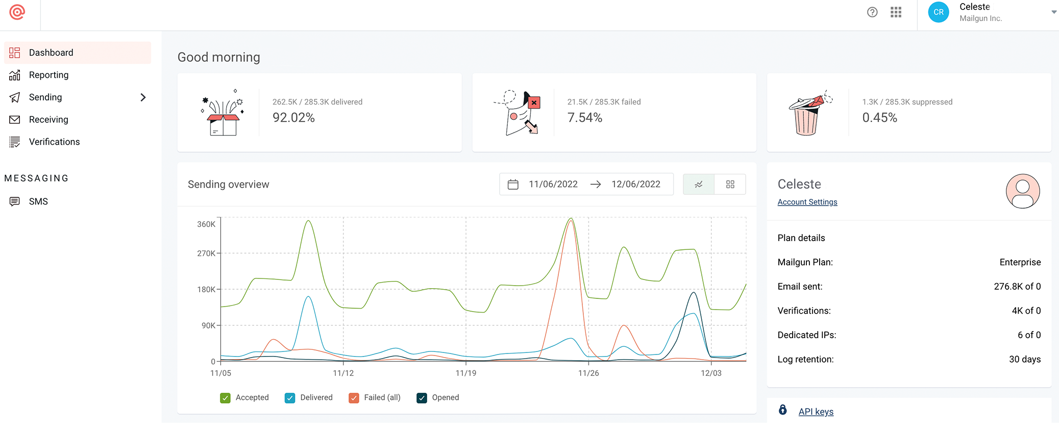
- Mailgun Team: Celeste Rance, Jonathan Kruse, Iqbal Singh, Levi Trejo, John Badali, Chris Farmer, Nicki Snyder (design)
- Exec Sponsor: Josh Odom
This project started as a grassroots movement within Mailgun and grew as it caught fire across teams. Today, our upgraded app is supporting elevated user experiences and an improved developer experience. But we’re not done. We’re never done.
Want to jump backstage and follow our stories as we deploy more cool things? Subscribe to our newsletter to stay dialed in.