How to use email-safe fonts and typography for accessibility
In the digital realm, web accessibility means developing elements in websites or emails to bypass any temporal, situational, or permanent disability. After all, you want to help your email team reach as many users as possible.
On average, people spend 10 seconds reading brand emails. This means you have 10 seconds to grab their attention. Creating an accessible email with email-safe fonts and typography helps convey the message to those who find it difficult to access your emails and provides a great user experience for all of your subscribers.
In this article, we’ll talk about email-safe fonts, including what they are and why they’re important for your emails. Then, we’ll go over how to choose a font for your email and how you can use typography to improve accessibility in your emails.
Why are fonts important in emails?
Fonts are a vital component of brand identity, much like colors and logos. Consistent use of specific fonts across all communication channels, including emails, helps reinforce brand recognition and build trust with your audience.
The typeface you choose can set the tone for how your business is perceived; a sleek, modern font might suggest innovation, while a classic, elegant one can evoke sophistication and timelessness.
Fonts can spice up your email campaign. You can use different fonts to:
- Show off your creative side. Be playful with fonts to help your email team create impactful content to capture your subscriber’s attention.
- Stand out from the crowd. An inbox is a crowded place. Keep your user’s attention once they open your emails with strategic use of creative fonts.
- Develop a strong visual identity without using images. You can use images to develop a strong visual brand identity, but images usually have their own email client support and rendering issues. Use email-safe fonts to build your own visual brand or product identity without resorting to images. Professional typography ensures credibility and a polished design.
What are email-safe fonts?
Fonts can enhance your email’s design, but if an email client does not support the chosen font, it will substitute a fallback font, which may disrupt the email’s layout and style. To avoid this, use email-safe fonts that are widely supported across devices, clients, and operating systems to ensure your emails display consistently. Ensure fonts are tested on various devices and email clients to confirm they display correctly and maintain your email’s intended appearance.
The only caveat is that using web-safe fonts – widely supported across email clients and devices – is crucial to ensure your email displays correctly, though this shortlist of fonts can sometimes limit design creativity when trying to stand out in crowded inboxes. Here’s a list of some email-safe fonts:
- Helvetica
- Verdana
- Sans Serif
- Georgia
- Times New Roman
- Arial
- American Typewriter
If you want to expand your font base further, consider using web fonts like Google Fonts that are hosted on a server.
What’s the difference between serif and sans-serif?
As you probably know, a font is a typeface that the email client uses to display the text. There are two types of fonts: Serif and Sans-serif.
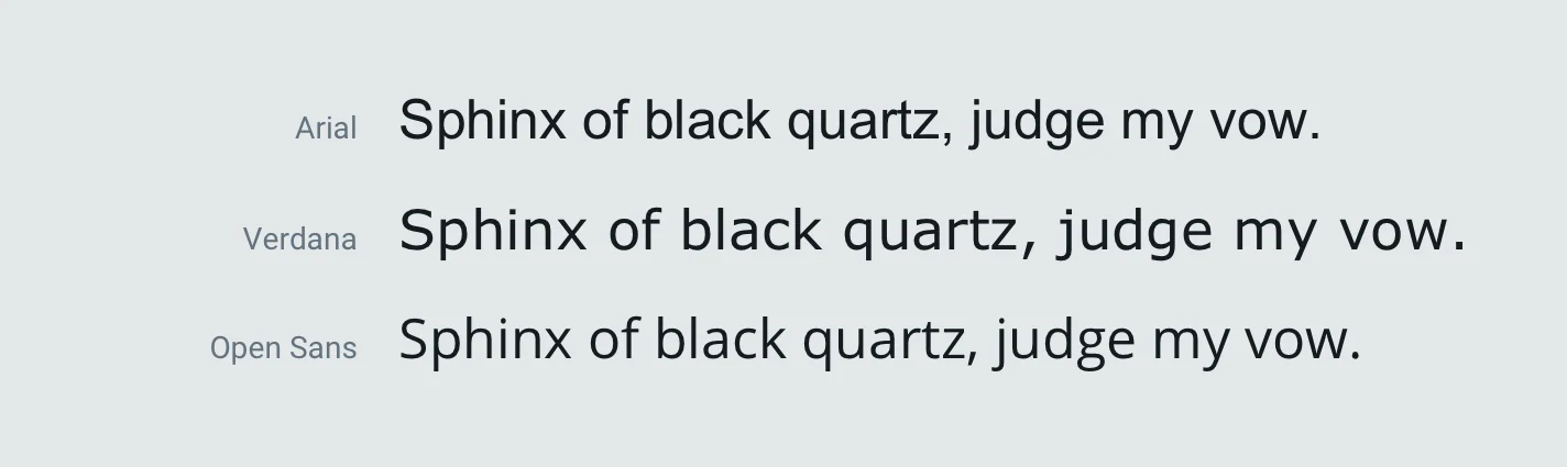
Here are some serif fonts with a sample sentence to give a visual example of the font:

They have small embellishments (serifs) at the end of each character, which guide eye movement from letter to letter. However, serif fonts with decorative details can also strain the eyes when used in large paragraphs, especially if the font size is too small or contrast is poor. This makes them less accessible across different devices and screen sizes.
Here are some sans-serif fonts with a sample sentence to give a visual example of the font:
In these fonts, each character in a word is separated from another. When it comes to email design, sans-serif characters are easily distinguishable on a screen and don’t tire the eyes as much as a serif font.
Can fonts affect the tone of my emails?
Fonts have a “personality” and can evoke specific emotions, acting as silent storytellers that convey the mood and atmosphere of your content. For instance, serif fonts can exude tradition and authority, while sans-serif fonts often radiate modernity and clarity in email design. Script or fantasy fonts can inject personality and creativity but should be used sparingly to avoid overwhelming the reader. The right font can inspire, comfort, or excite, making a lasting impression.
How do I choose a font for my email?
There’s no such thing as a “best font” for your email. But now that we know what email-safe fonts are and why fonts are important for your emails, here are some things to consider when choosing a font for your message:
- Brand consistency
- Readability
- Legibility
Let’s go over each of these in detail below.
How can I maintain brand consistency with fonts?
It’s important to think about your product’s visual identity and messaging when picking out your fonts. What will go best with your transactional and marketing emails, and which are web safe? Arial, Tahoma, and Verdana are all great sans-serif, web-safe, and email-safe fonts. They’ll be readable in the most clunky and unsupportive email clients.
If your brand identity aligns more with tradition and professionalism, consider using serif fonts like Times New Roman, Georgia, and Courier New, which are supported by most email clients. Meanwhile, sans-serif fonts such as Arial, Helvetica, and Verdana are often preferred for their clean lines and readability on digital screens.
Why is readability important?
The font you choose needs to be both readable and legible to ensure your email’s message is effectively communicated. If the font is difficult to read, your message may be lost or your email quickly deleted as readers only spend about 10 seconds skimming their inbox. Ideally, you want your font sized between 14 and 16 pixels for body text. This ensures that readers can quickly identify words and retain their message.
Why is legibility important?
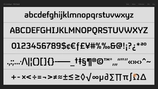
Legibility ensures that identical-looking characters such ‘1’ (one), ‘l’ (el), and ‘I’ (eye) are easily distinguishable. In the example below, each character is distinguishable and cannot be confused with the other.
Whether an email-safe font is readable and legible depends on the font and font family.
How can I improve accessibility with typography?
Contrary to popular belief, creating accessible emails doesn’t always mean reworking your HTML email template from the ground up. By tweaking different email design aspects like the color contrast, typography, or call to action (CTA) placement, your emails can become more accessible to a larger audience. Strategic font choices can guide the reader’s attention and improve engagement. Varying font sizes, weights (bold), and styles (italics) can create a visual hierarchy, emphasizing critical points, headings, and calls to action (CTAs). This helps readers quickly scan the email, identify key information, and encourages them to take desired actions.
By tweaking different email design aspects like the color contrast, typography, or CTA placement, your emails can become more accessible to a larger audience.
Easy fixes mean less of a headache for you and better reading for your audience. Plus, typography in emails isn’t just restricted to the fonts you choose in your email but also extends to font-styling, formatting, and words per line.
How can I use emphasis to make my email easier to read?
Make it easier for your subscribers to quickly scan and understand your emails by using stylistic emphasis such as bolding, italics, or underlining to highlight key information. This visual hierarchy helps readers identify important points and encourages them to take the actions you want.
How can I use line spacing and words per line to improve accessibility?
If your paragraph has closely placed lines, it becomes difficult to jump to the next line when you reach the end of the current line. Always maintain a line spacing of 1.5 times the font size for better accessibility.
The number of words you cram in a single line can make the line length long enough to tire your eyes before you return to the start of the next line. Don’t have more than 75 characters in a single line to improve the reading experience. This added measure ensures better user interpretation and engagement with your content.
How can I use text formatting to improve my emails?
Use text formatting to improve your emails. Separate different sections of your email copy through proper formatting. Headers need to be at least 22 pixels to separate them from the 16 pixels of the email copy. Sub-headings can be 20 pixels to better distinguish from the header but still stand out from the paragraph text.
How does font color affect accessibility?
Although this isn’t particularly part of typography, a dark font over a white background is readable from an arm’s length minimum. This means that you don’t have to stick to a black font; you can be a little flexible with color. If you have a darker color in your design guidelines, feel free to use that instead.
Wrapping up
Creating accessible emails helps you reach out to your subscribers who may be experiencing temporal, situational, or permanent disability while creating a strong user experience for the rest of your subscribers. Picking a reliable email-safe font means your email layouts are less likely to break and become an unreadable mess.
Want to learn more about developing more accessible emails? Mailgun’s email API offers email accessibility features you can trust.